Our existing server monitoring experience exposed very little of what customers actually needed to understand server health. The data we did show lacked context, important metrics were missing entirely, and there was no simple way to understand whether a server was healthy without already knowing how to interpret the numbers.
I helped shape a new monitoring experience that made server health easier to understand at a glance, easier to investigate in detail, and easier to act on when something needed attention.
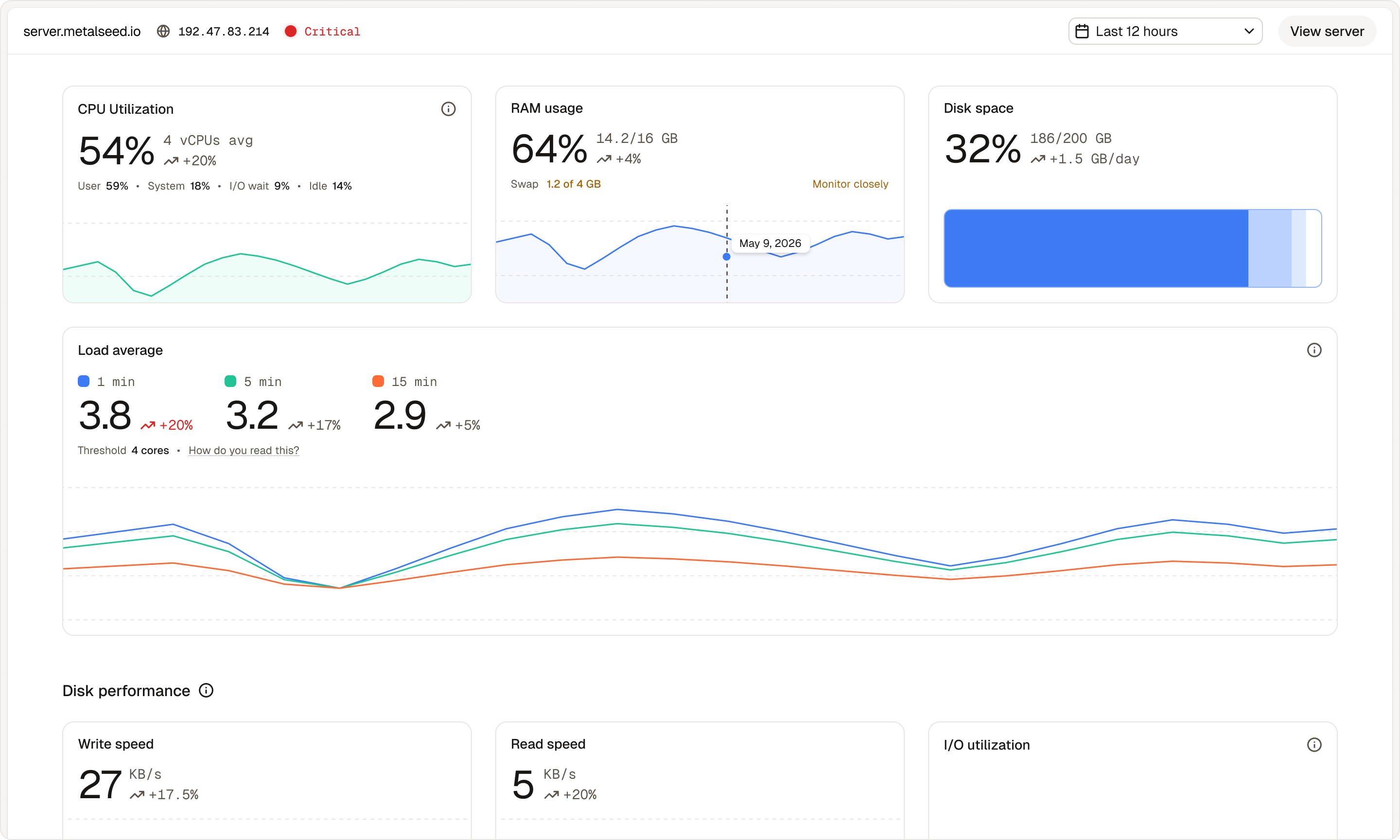
The problem
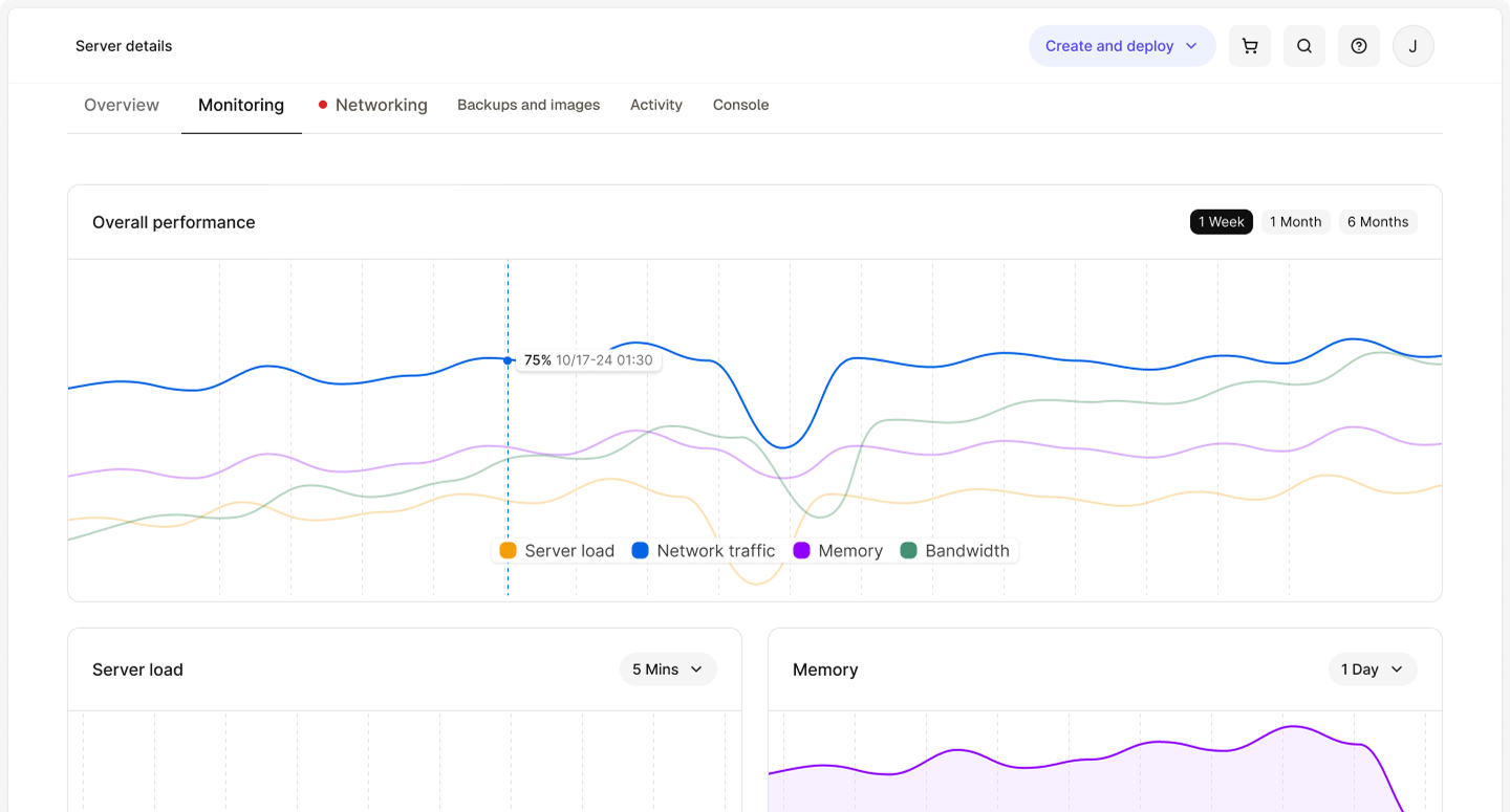
The original monitoring experience was too limited to be meaningfully useful.
Customers could only see a small set of metrics, and even those were presented without enough context to make them actionable. A server could be under real strain with little to no clues in the interface. There was no strong threshold guidance or clear path from a concerning metric to a next step.
We didn’t just need to add more charts. We needed to make monitoring easier to understand and more useful in practice.
The approach
This was a product-design problem, not a dashboard-skinning exercise.
The goal wasn’t to just surface more infrastructure data. It was to translate server health into an experience customers could scan, interpret, and act on with less effort. That meant thinking carefully about module structure, time ranges, and the relationship between high-level overview and per-server detail.
It also meant contributing across design and implementation.
The previous monitoring tab
The new direction
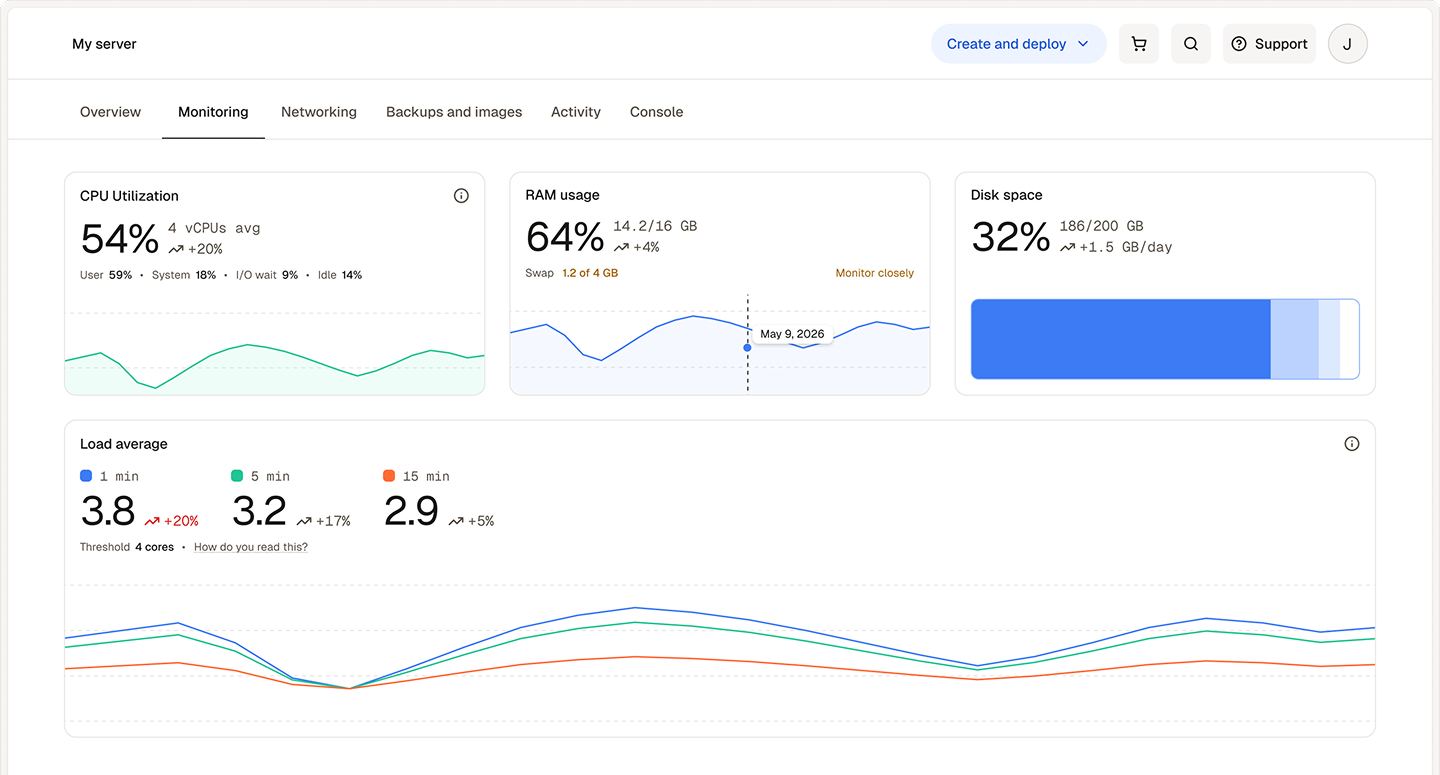
The solution
Building on the product direction defined in the brief, I designed key modules and flows, then implemented them directly so the final product stayed closely aligned with the intended experience.
The work focused on making monitoring easier to understand at a glance, more actionable when something needed attention, and more cohesive across the different views customers would rely on to assess server health.
The bulk of the work was redesigning the monitoring modules themselves so they communicated more than just data points.
I designed key modules for CPU, RAM, load average, disk health, and network activity, with a focus on making each module easier to scan, interpret, and understand in context.
A major part of the redesign was making the experience more actionable.
I helped define threshold cues, severity behavior, and supporting guidance so customers could better understand when a metric was healthy, when it needed attention, and when it pointed to a larger problem. That made the dashboard feel less like a collection of charts and more like a product that could help customers make decisions.
My role extended beyond design files. I also implemented several of the shipped modules directly, including work across core metrics, disk health, and network-related monitoring.
That helped keep the final experience closely aligned with the original design intent and let me refine details in the product itself rather than stopping at handoff.
Why it worked
This project was one of a few that were meant to lay the groundwork of a fully-fledged Dashboards feature within our product. The design decisions, both visual and under the hood, would have an outsized impact since they would inform many other views across multiple surfaces within the app.
Just as importantly, it reframed monitoring as a proper product experience instead of a technical afterthought. It shifted the value from simply showing data to helping customers understand what that data meant and what to do with it.
Key takeaway
Good monitoring design is not just about exposing metrics. It’s about turning technical signals into something people can read, trust, and act on.
For me, the most meaningful part was the opportunity to shape that translation directly, from problem framing and module design to implementation of the experience itself.
Project status
This effort is still in the works, with initial frontend implementation underway, backend work continuing to expose the new data, and a fleet-wide view in design.