Our hosting management app had a persistent awareness problem: users could tell that something had happened, but not always what it meant, whether it mattered, or what to do next.
I led a redesign of the notification experience to make account activity clearer, more actionable, and easier to trust. Rather than treating notifications as isolated alerts, I reframed them as part of a broader activity system and designed a dedicated inbox experience around that model.
The problem
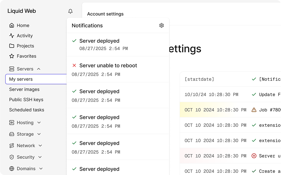
The existing experience used a familiar bell-and-popover pattern, but it wasn’t a good fit for the system underneath it.
Our “notifications” were actually built on top of a decade-old account activity model with inconsistent structure, vague messaging, and unpredictable content length. A single item might contain a simple server update or a few paragraphs of technical maintenance details. The UI looked modern, but the experience was hard to scan and difficult to act on.
That left users asking themselves questions like what had happened? Is this still in progress? What is it related to? Do I need to do anything? And most importantly: Where do I go next?
The approach
A year earlier, I had tried to modernize the experience by adapting it to that more standard notification pattern. That approach didn’t hold up, because the real problem wasn’t visual polish, it was the underlying product model.
The system wasn’t built around lightweight alerts. It was built around events and account activity. Once I stopped trying to force it into a conventional notification UI, the right direction became much clearer. Instead of designing a better popover, I designed around the structure the product already had.
The solution
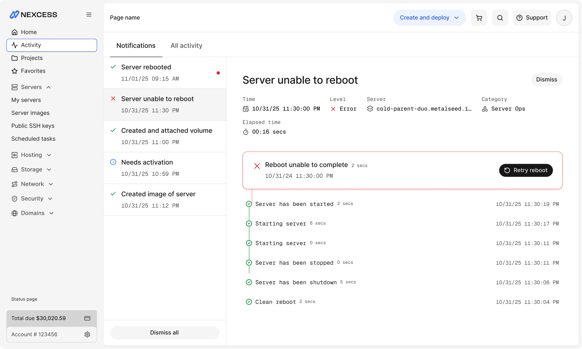
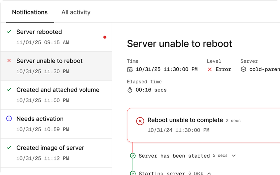
I redesigned the experience as a full-page destination with two connected views, an inbox for unread and relevant events and a full account history. This gave users a clearer place to check what was new, while also giving the system enough room to show meaningful detail and history.
The original popover constrained both the content and the mental model. Moving the experience into a dedicated inbox created more room, clearer hierarchy, and a stronger sense of place in the product.
The system was built around notifications containing multiple updates over time, but the old interface flattened that structure. Reframing each notification as a timeline of events made the interface more understandable because it reflected the actual logic of the system.
The old experience surfaced information, but didn’t do much to help users respond. Introducing dynamic actions based on the latest event state reduced the work users had to do after interpreting a message and made the system more useful in the moment.
Why it worked
Embracing the structure of the underlying system instead of fighting it was key.
Rather than flattening account activity into generic alerts, I used that event-based model to create a clearer mental model for users, shifting the experience from passive information display toward guided problem-solving.
Key takeaway
This reinforced an important lesson for me: familiar UI patterns only work when they match the logic of the system behind them.
The strongest part of this work wasn’t the interface itself, it was reframing the problem. Once I treated notifications as activity rather than alerts, the product direction became much more coherent.
Project status
Most of the frontend experience was implemented, but release was paused due to backend dependencies and shifting team priorities.